Journey to Fresh.
THE BRIEF
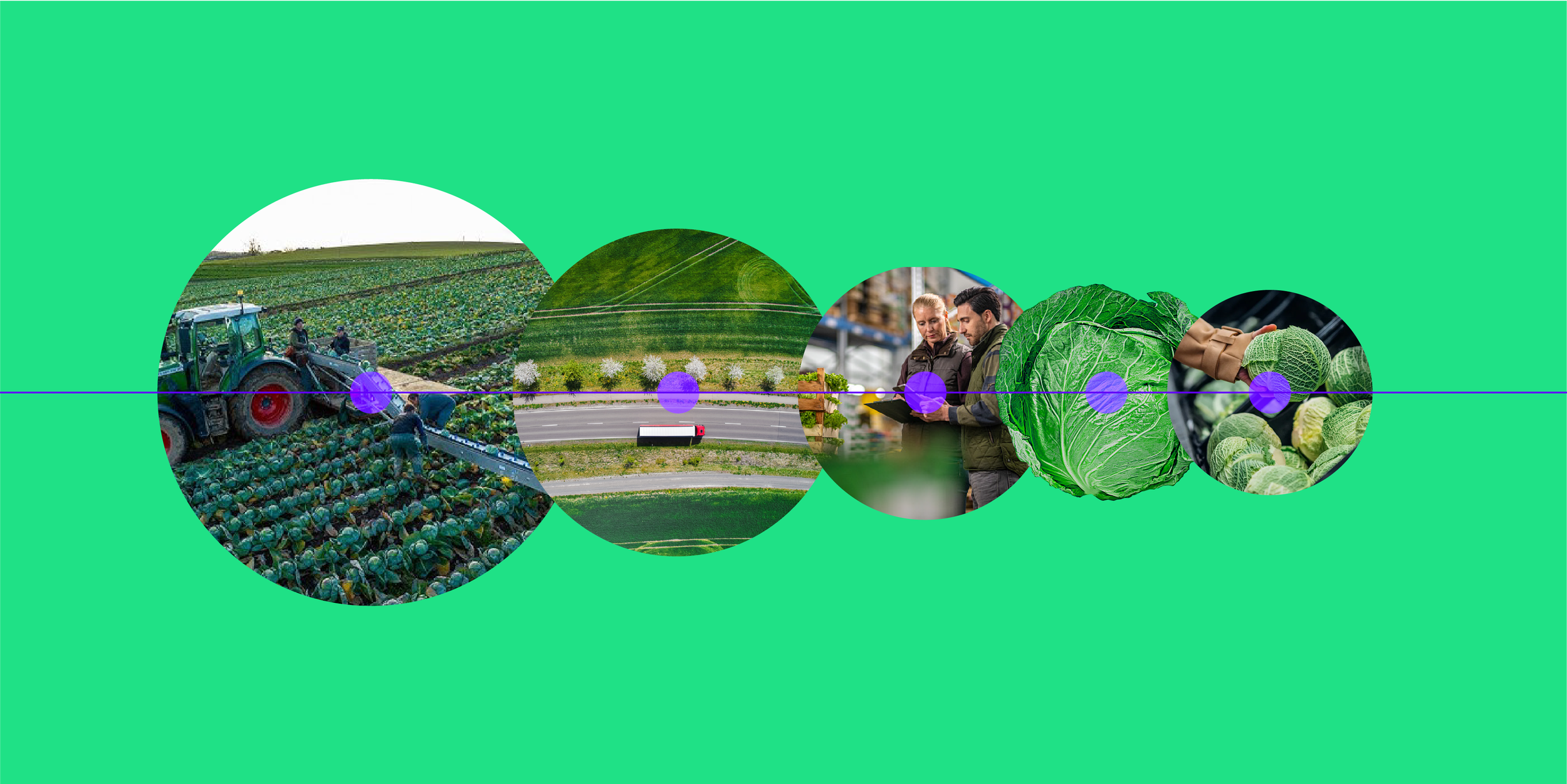
FreshAhead is pioneering a new approach to the journey of fresh food. The “Journey to Fresh” visual identity is vibrant and dynamic, using color in a dramatic way to represent FreshAhead’s radically new approach to AgTech. When it comes to food, the vivid, rich hues of healthy produce depend on the optimization of technology long before it hits the plate. Highlighted is this dual nature of fresh and digital, along with FreshAhead’s confident, forward motion and deep insights across the entire agriculture supply chain.
ROLE
Creative Direction and Design Execution
As the most Senior creative on the team, I led ideation, creation, and rollout of a new visual brand identity system, including templates, collateral, and marketing materials (sales decks, tradeshow booths, digital ads, and other programs) and design vision for their website. Design execution as needed.
DELIVERABLES
Logo & Brand System • Corporate Collateral & Sales Materials • Web Design
STRATEGY
FreshAhead’s pioneering a new approach to the journey of fresh food inspired our discovery phase as we sought to clearly articulate their unique positioning. Insights gathered during the D&A phase led to FreshAhead’s focus on connecting—Connecting and transforming information at every point of the process. Connection by optimizing the entire journey of fresh food, from growers to processors and operations to logistics. Connection by seeing beyond today’s challenges into those of the future.
BRAND PLATFORM
FreshAhead helps you accelerate fresh. From growers to consumers, we’re committed to empowering agriculture businesses to think ahead and drive meaningful change. We’re not just accelerating transformation—we’re accelerating potential. We’re accelerating fresh. Let’s make it happen together.
THE RESULT
The “Journey to Fresh” visual identity is vibrant and dynamic, using color in a dramatic way to represent FreshAhead’s radically new approach to AgTech. When it comes to food, the vivid, rich hues of healthy produce depend on the optimization of technology long before it hits the plate. Here, we highlight this dual nature of fresh and digital, along with FreshAhead’s confident, forward motion and deep insights across the entire agriculture supply chain.
LOGO
Bold, contemporary, and forward-thinking—the logotype allows the audience to recognize and interpret the brand name quickly—identifying FreshAHead even at a glance. This readability, combined with a unique customized typeface, makes the logo memorable. The custom A is an upward-pointing arrow, subtle enough that it meshes with the other letter forms. Bold enough that it expresses what’s at the brand’s core.
PHOTOGRAPHY
Combining photography with patterns + texture illustrates the seamless transition from the tangible, real world (hands-on farming) into the digital realm (FreshAheads platform). Integrating photographs with graphic overlays that symbolize technological innovation and system frameworks enhances visual storytelling.
PATTERNS & TEXTURES
SHAPES Abstracted shipping containers and warehouse technical drawings represent the digital framework—building blocks for innovation: an innovative platform from the bottom up that is easy to use and works smarter and harder.
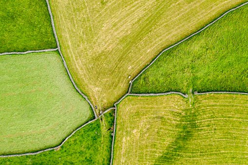
PATTERNS Abstracted aerial photography represents what is at the heart of AgTech—using advanced data analysis to optimize agricultural processes.
ILLUSTRATION
HYPERREALISM
EVENT EXPERIENCE


