
Aisera brand idenity.
BRIEF
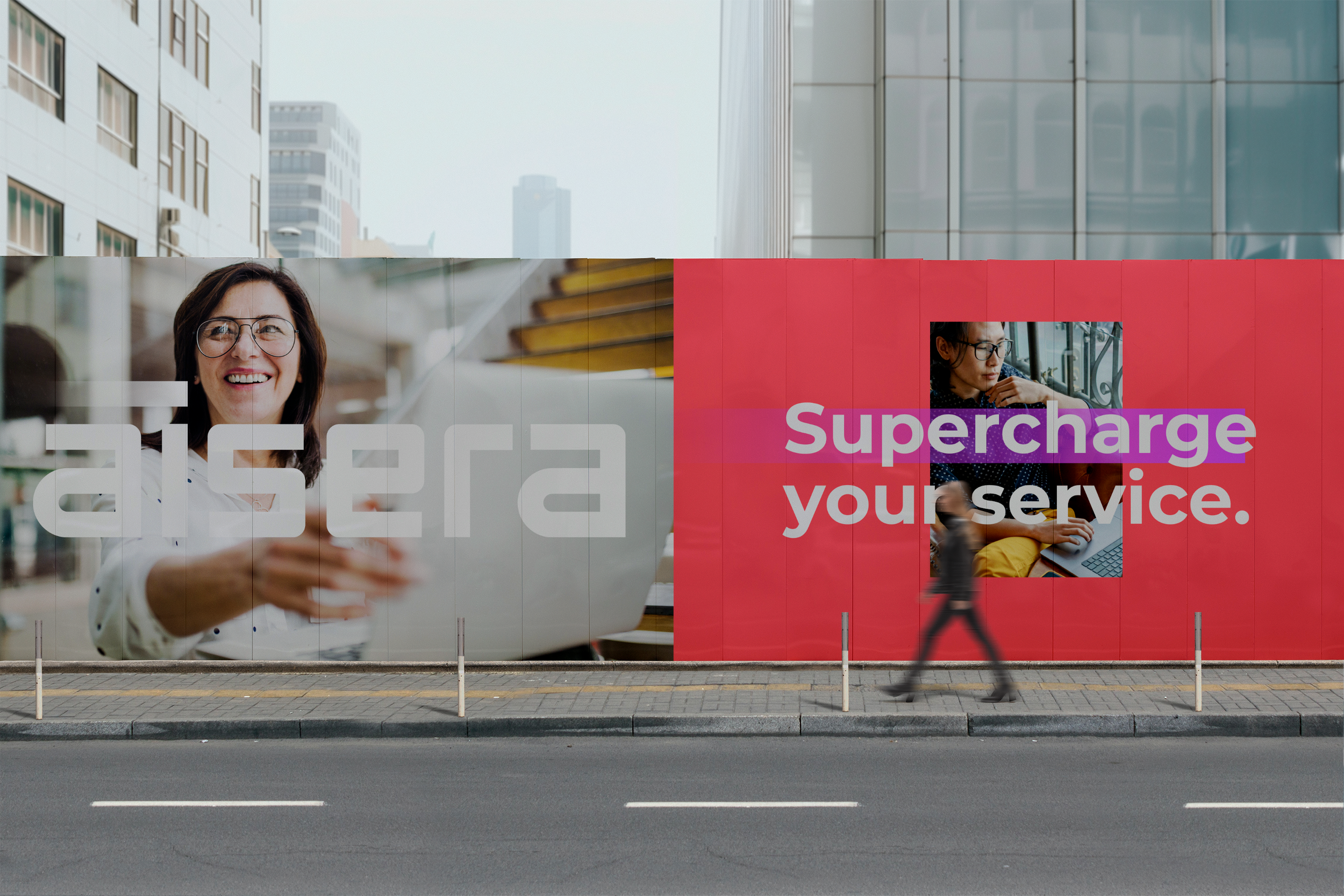
The challenge was to visually articulate Aisera’s brand evolution–AI empowering people. We retained that core watermelon red color, building a bright, modern palette around it to signal innovation. The logo refresh highlights the “Ai” and conveys intelligence and momentum. Impactful photography is vibrant shots of confident, smiling individuals effortlessly navigating their work and lives, clearly benefiting from Aisera’s invisible support. Headlines like 'Empower your employees and customers’ and 'Automation without compromise' support the bold visuals, showcasing a future where technology genuinely elevates human potential.
ROLE
Creative Direction • Design Execution
As the senior creative on the team, I shaped the look and feel of the brand from the beginning, including art directing more junior designers and copy direction as well as hands-on design execution. Starting with the brand persona and storyboards, I presented creative directions to executives. Delivered a color palette photography art direction for choosing stock images and final production of logo and brand asset files.
DELIVERABLES
Logo. • Brand Identity


ADDITIONAL PROPOSED DESIGN DIRECTIONS


