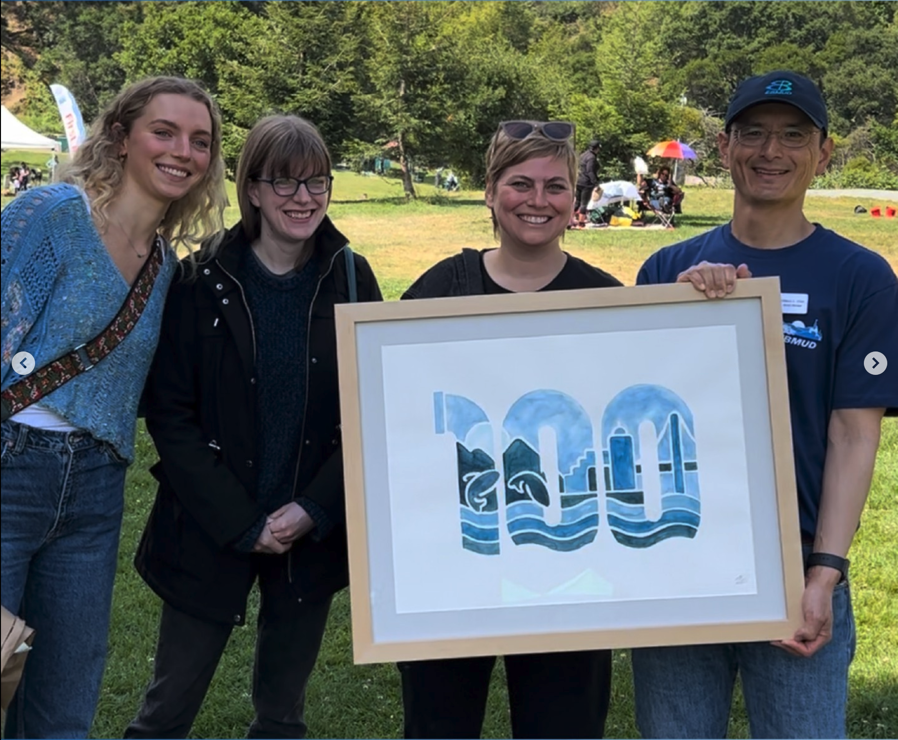
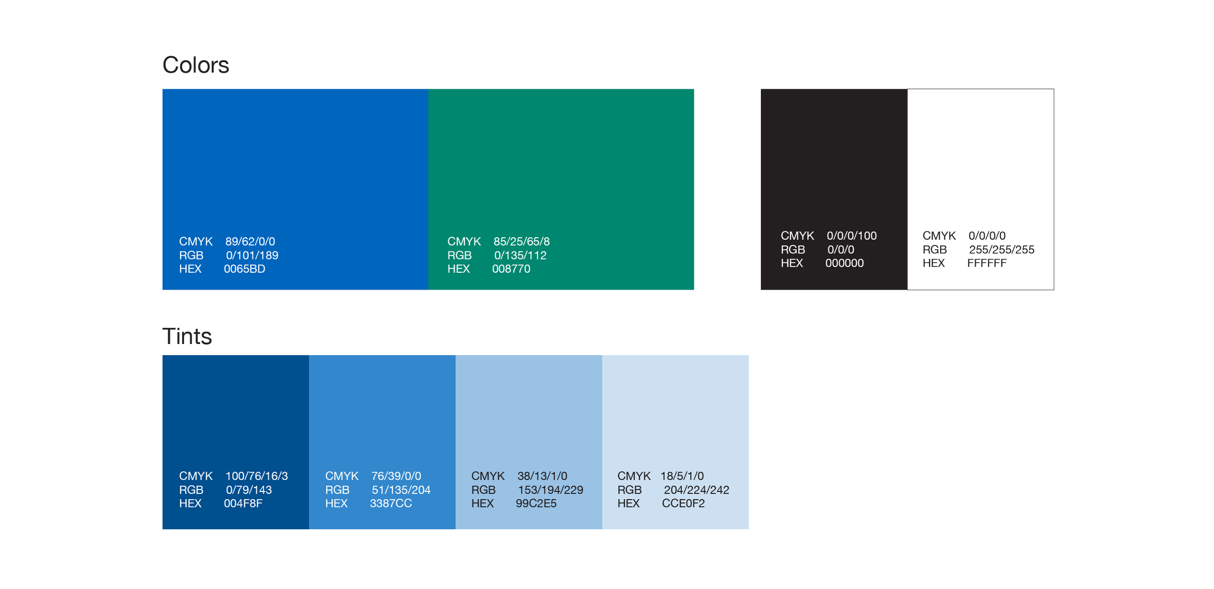
A century of stewardship.
BRIEF
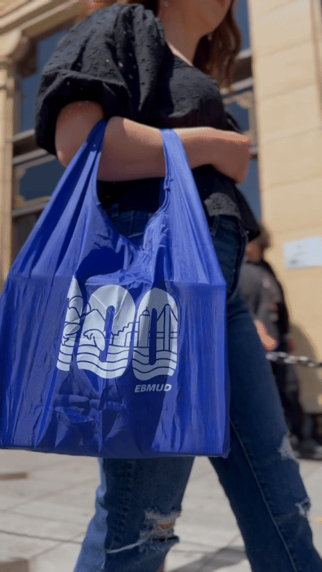
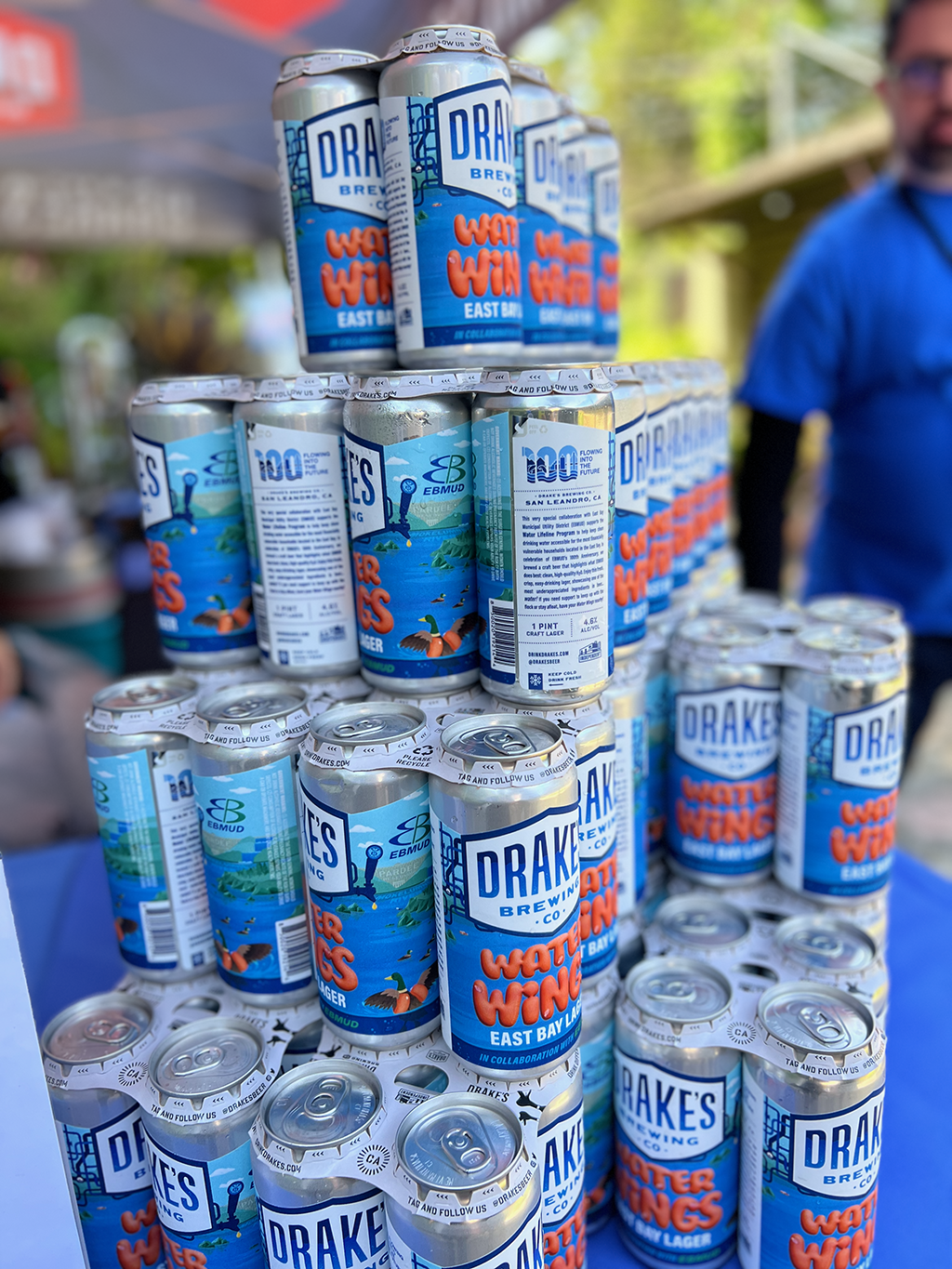
To mark its 100th anniversary, EBMUD needed a Centennial logo that could honor a century of public service while looking ahead to the future. The logo had to be clean and simple enough to function at small sizes, yet conceptually rich—conveying themes of environmental conservation, community, infrastructure, safe drinking water, and a deep connection to the East Bay. It also needed to lock up cleanly with a commemorative tagline and feel cohesive alongside the existing EBMUD logo.
CHALLANGE
My challenge was to distill complex themes into a logo that felt cohesive, memorable, and versatile. I used visual metaphors and regional cues to represent EBMUD’s mission without overwhelming the mark.
RESULTS
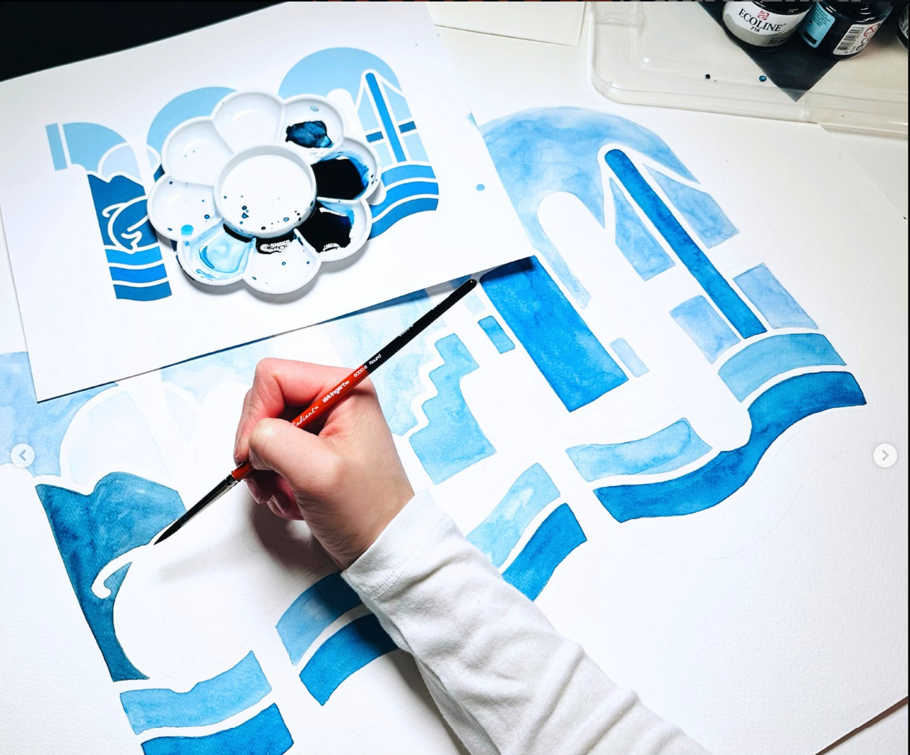
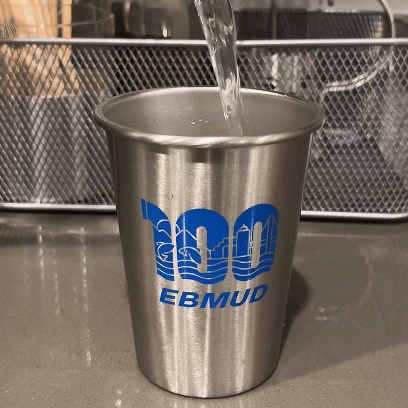
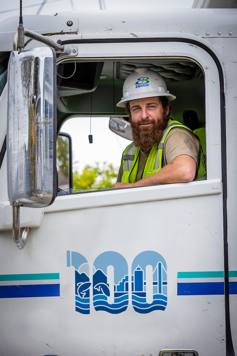
Even the simplest solutions have to do a lot of heavy lifting. EBMUD was looking for a lot from their 100-year logo. I created a strong, simple, sophisticated image that tells a lot of stories in one and acted as an anchor to their anniversary campaign.
ROLE
Research + Discovery, Logo Deign, Art direction (video & billboard design)
ALTERNATES
1-COLOR
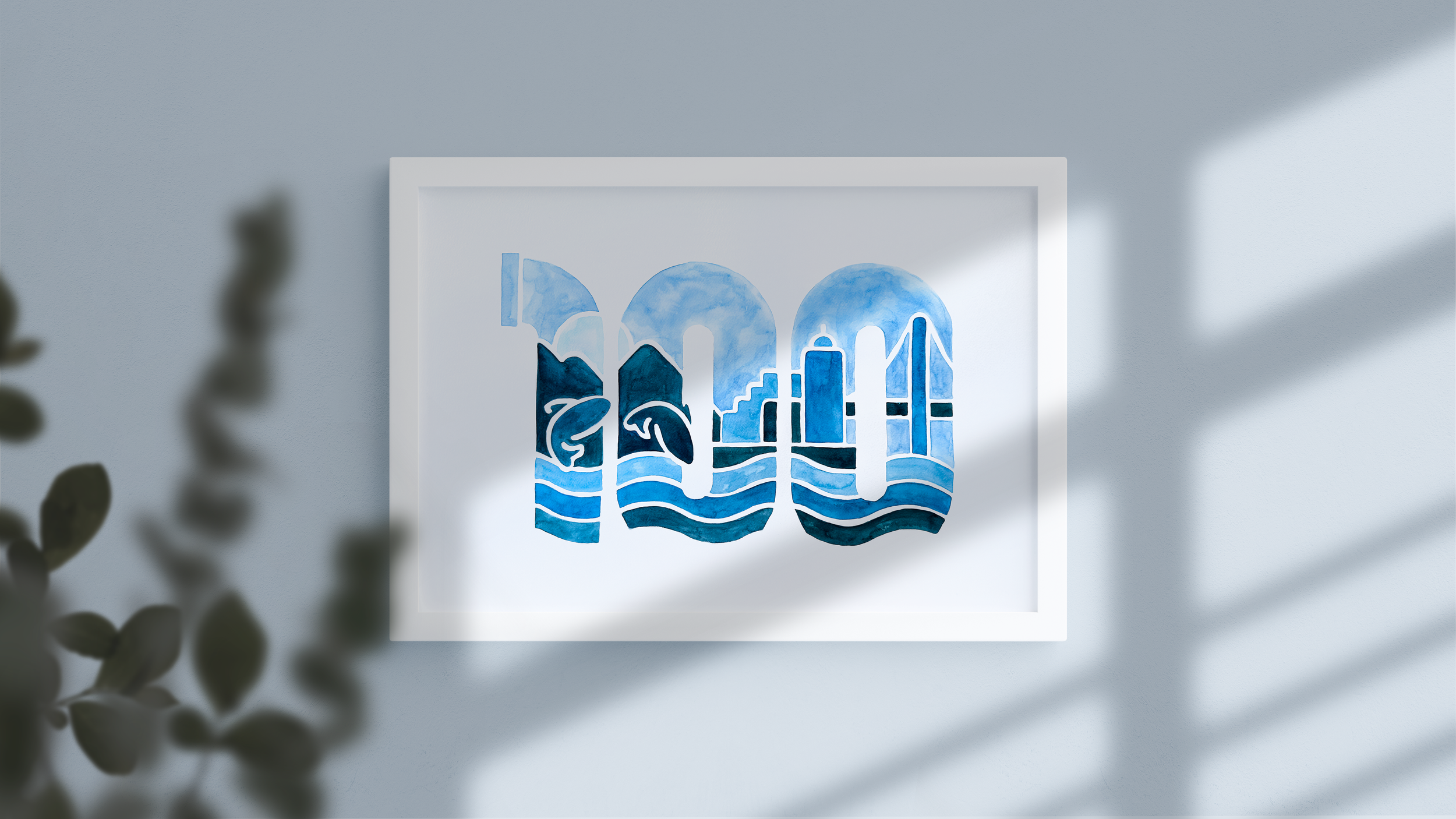
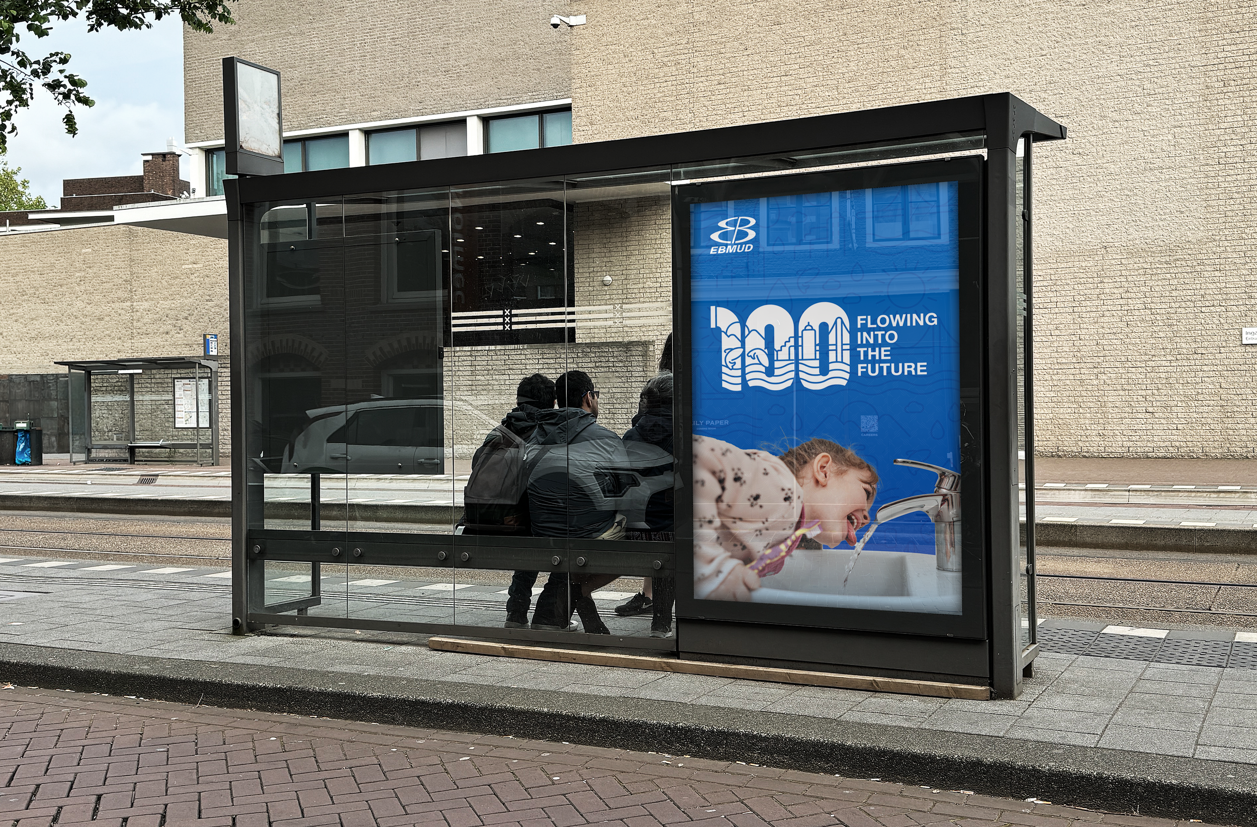
Flowing into the future.
The logo tells the story of the East Bay water lifecycle—from the High-Sierra watershed of the Mokelumne River to the collection and treatment plants in Emeryville.
BLACK

LOCK UP + TAGLINE

ADDITIONAL PROPOSED LOGOS